All about colour
May 21, 2015

Second in the bottles/ painting series
This is the second oil painting in the series inspired by Rende’s photos of bottles against one of my previous still life paintings. See this post for the first one and some background info.
As I mentioned in the other post, painting something that is already beautiful is not my usual choice. But the richness he captured in the glass against the colourful painting spoke to me. I hadn’t worked with such saturated darks before, and I loved using them.
Nicholas Wilton’s latest post about colour is full of good practical information, a sort of Colour 101. And I appreciated that even though he gives workshops, he is generous about sharing his insights and knowledge for free as well. Basically he breaks down colour theory in painting to 3 main choices, and they all have to do with contrast. Are you going to use a dark or light colour next to your existing colour? Will it be saturated or diluted/toned down? And finally, will it be a cool or warm colour?
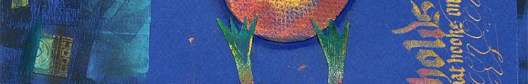
All these choices are going on instinctively while I paint. Even though I have a photo as reference, and this dictates my choices to some extent, effects, transparency, back and foreground can all be influenced by the 3 principles Wilton mentions. I’m starting on the third one now, a bit more ambitious as far as complexity. And it really does help to be more conscious of how the colour is going to work in the painting. Here are 2 previous phases of the finished painting above. In this one, after sketching in the approximate colours, I worked from dark to light and slightly more painterly than in number 1.

Set up for second painting

an in- between phase
Barry Lopez: Tell a story that helps
May 5, 2015

Barry Lopez (source of photo)
Barry Lopez is one of the writers who has ‘accompanied’ me on most of my adult journey as an artist. (See my post Barry Lopez, A literature of hope ). He is a nature writer, but that short description doesn’t do him justice. He is also a poet who feels the pain of the Earth deeply. And, he is an artist who understands and exemplifies what art is for, especially in these times.
I love these artists and role models,who have sustained their passion and honed their craft over the years. They are gradually turning into our present day Elders. Hearing Gary Snyder or Barry Lopez speak unfailingly reunites me with the best in myself.
This morning I looked at an almost completed draft of my book so far and couldn’t relate to it. I’d momentarily lost my sense of True North, and wondered how I would finish it with this late-stage failing of nerve. Unable to write, I decided to do some research for a later chapter on ‘art and wounded places’, and watched several of Lopez’s talks. And one of them showed the way out of of my impasse. It gave me a new lens for looking at my work and lifted me out of the familiar contradictions I usually get caught in when stuck.
He spoke about story telling. He’d had a conversation with a traditional man,( I sense he meant someone indigenous), and asked if this man’s people made a distinction between fiction and non-fiction like we do in Western society. The man answered, ‘For us, the difference isn’t between fiction and non-fiction, but between an authentic and inauthentic story.
Lopez asked him the difference and he said, ‘An authentic story is about us.’
‘Yes?’, Lopez asked.
‘And an inauthentic story is about you’, replied the man.
Lopez had a crucial insight as a result of this conversation. He realised that the story you tell as a story teller is not worth our listening to if it is just about you. He said,’We don’t need to know about you, we need to know about us’. I think what he is saying here, is that a writer needs to delve down beyond the purely personal until he strikes something universal in human experience which will illuminate all our lives. Also, adding my own note here, if an artist is working with rage or pain, she has a responsibility to transform it before it hits the page. We all know how bad life can be, we have the mass media to tell us all about that.
It is the artist alchemist’s task to harness that personal negativity and transcend it, and to use it as raw material to craft images of hope.
Lopez says that an authentic story needs to do two things; first of all it has to help. And secondly it has to be about ‘us’.
I want everything I write to end with this note:’Here is what I saw, what do you think?’. Instead of saying, ‘Here is what I saw and this is what you should believe’. -B.Lopez
The writers, artists and musicians I’ve respected most and who have inspired me in my life so far, are growing older along with me. Like Barry Lopez, time and experience distil their youthful passion to a focused potency. I feel enormous wisdom radiating from these people. But even more than the understanding they have gained through living and practising their calling, they embody compassion.
Lopez said,’
I want more than anything to see people do well. I want to see people thrive. And the system I see in place all over the world is killing people. I feel that as a physical pain, as grief every day when I get up in the morning. What drives me is – if you’re going to tell a story, tell a story that helps. If you’re going to collaborate with directors, filmmakers, artists et , make common cause with people whose desire is to help.
Not to direct the show or tell somebody else what to think, but to behave in a helpful manner for the benefit of everybody.
(See the 3 minute clip of this talk here )

Bottles and still life, oil on canvas board
I’ve been concentrating on developing my oil painting for nearly 5 years now. Having a long career as a fine artist, graphic designer and calligrapher up until then, I already had a good foundation of drawing and composition. So I didn’t have to start from scratch, luckily. It has been mostly about learning the medium, and I’ve shared that process here fairly regularly. This is my first painting after a several months interlude of copying the work of some other artists. I learned a lot from that process, mostly about paint application and relaxing a little.
Basically I’m satisfied with this painting, it is another step along the way. What I am sure of, though, is that this isn’t my destination- ie perfecting realistic representation. I’ll talk more about that in a minute. Meanwhile, this has a nice story behind it.
Awhile back, I took a photo of a bowl of nectarines at my mother in law’s home and did a few paintings from it.

It eventually landed downstairs near where Rende’s computer is. We moved my bottle collection out of our show window and they ended up in front of this still life. (You may recognise some of my first paintings of this collection from several years ago.)


So the bottles against the still life caught Rende’s magic eye, and he made several photos, they were so rich and juicy and deep, they nudged me out of my uninspired period- I had to paint them.
Painting something that is already beautiful is a major challenge! The question is, what can you add? The painting all the way at the top is a response to the richness of Rende’s photo, but it is also about mastering technique to capture what moved me. I liked the sharp clarity of the glass against the fuzzy background; a special challenge was muting the fruit still life behind the glass to make it look out of focus as it was in the photo.
But technique is never the end goal, it is simply a tool. My journey in paint is away from rendering to suggesting. But I don’t know how to do that, so I have to keep doing one piece at a time and let the work teach me. I don’t know if anyone can see the steps made since the first glass paintings, but I am moving closer to painting the way I feel.
Also important to me, not quite achieved in this last painting is letting go of form to the extent that the canvas surface becomes interesting in itself. The rhythm of the brush strokes, the layers of paint, the texture of thick and thinly applied colours all are more interesting to me than depicting a real object perfectly.
I want to paint that way NOW. But take it from me, this process of discovering your own vocabulary of marks can’t be rushed or forced. In ‘Art and Fear’, by Bayles and Orland, (super book by the way), I remember something about how important it is to develop pleasurable working habits, and that these somehow also help you to find your work. I think even the set up of your palette could influence how you use colour, for example. One person might place the cadmium yellow closer and another might place it at a far end, so it is less easy to reach- so you just end up using the colour closest to you.
I watched a video of David Hockney painting one of his landscapes from his show ‘a Bigger Picture’. All his years of daily work just flowed out of his brush like a guided dream. He did one complete painting a day, and it looks so easy! But watching him taught me about working from back to front (sky first, then branches) in a landscape. It completely changed my thinking, so this is the set up for the next painting, same subject slightly different crop. I’ve sketched in the masses in the background and foreground, and am aiming to suggest more and work even more loosely.
Set up for second painting
