
When your muse goes AWOL
May 17, 2018

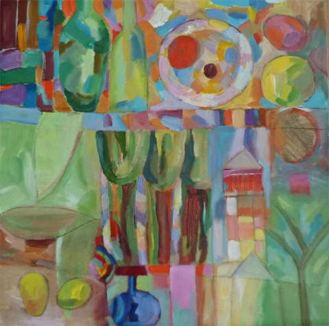
spring pacthwork oil pastels 30 x30cm
I finally moved the easel and paints, and all my brushes into the attic. They were taking up space in the studio and every day they reminded me that I was not painting. I’ve had ‘dry’ periods like this before, and always, the inspiration comes back.
Except that my situation is different now, I have a serious illness and most of my time and energy goes toward healing, whether is it going to and from treatments, or taking care of myself at home, it is nearly a full time job. (See my new blog appletreesz.wordpress.com if you want to know more.)
Admittedly, the fact that hardly any art sells these days (except for a fraction of artists who happen to be popular) is not very motivating for creating new work. And storage space starts to be a real problem. However when inspiration hits, these issues no longer weigh so heavily. You do the work for the joy of it, and worry about storing it later.
Anyway, when paints fail, I take out the oil pastels and play. Here are some recent pieces.These are kind of ‘new’ in that the figures and animals that have been wanting to appear in my work, have finally been allowed in. I’ve previously veered away from realistic subjects in my oil pastels, wanting to focus entirely on colour and pattern. But regular themes like houses and trees do recur.


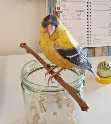
Johan Scherft, his amazing paper birds
March 15, 2018
You might remember that I had a spell of making felt birds. They were so labour intensive that I only did two of them. Here is one.

my felt coal tit
I love birds, we live in northern Holland and our bird feeder sees a good variety of songbirds visiting every winter. I wanted a way to have birds around me in my living space too. When looking on the web for models to paint or construct, I stumbled upon Johan Scherft’s videos of paper birds and was immediately sold!
He offers quite a few free models on his site and I started with those. My first attempt was a firecrest, it failed miserably but taught me the basic principles- here is the second attempt. You can still see the seam where the head meets the body not quite perfectly, but gradually you get better at the glueing and fitting. This was a sweet but tiny model to begin with.

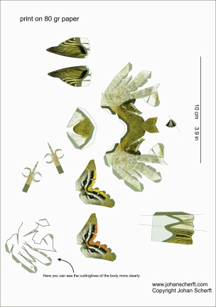
Firecrest paper bird model, all models designed and painted by J Scherft, and assembled by me
A word of caution, these are not projects to do with children, they are far too intricate, and they require a good dose of patience. The more I do, the better they work out, and the more appreciation I have for the exquisite rendering of the feathers, eyes, beaks etc. Not to mention how the whole birds are engineered, so that from a flat sheet of 80g paper, you end up with various parts- beak, head, tail cone, tail, which all fit together to form a perfect 3D model. Here is the firecrest sheet.
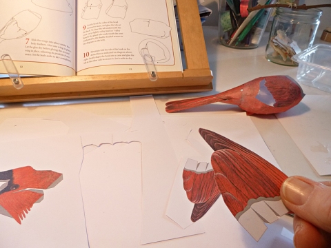
Cardinal under construction, this one is from the box available from Amazon
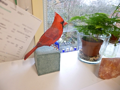
Here is the big guy done. Cardinals mean Pittsburgh and my US home to me, they have a special place in my heart, especially since they are not native to Europe, and we never get to hear their beautiful melodic trills here. God I miss them. But the blackbird’s song come in a close second.
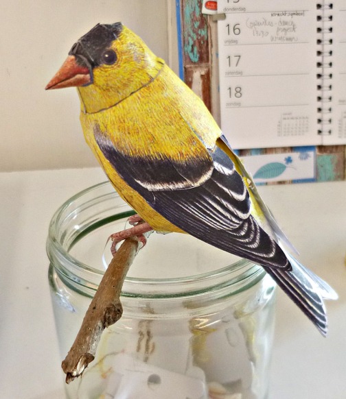
Here is an American Goldfinch, also from the paper birds box. It costs around 16 euros and includes a great instruction book, glue, and 4 models plus mounts for 4 different birds, so you can make 16 birds from it. I just perched this little guy on a twig for now.

There is a lot to love about these bird models, one thing is how he captures the personality of each bird. This is a nuthatch and his mount is a little paper log, his feet are spread in a characteristic pose, one ahead and one pointing back, you usually see them hanging upside down on the bark of a tree.
You might be wondering by now if doing these birds is addictive. Well, I’m on my 8th model now, what do you think? :-). Thing is that the crafting is very meditative. With a small sharp scissors, you cut out all the parts, then patiently glue the tabs and let them dry one by one. It can take hours to make one bird and a mount, but it is so rewarding.
Here is the wren.


Today I finished the humming bird, it is in honour of my mother, Monica, who loved hummingbirds.
Here he is hanging in my studio. This, by the way is the Big model (!!) The life sized one is tinier and is a whole new challenge in itself. Scherft kindly offers this one free to practice on first. (The tiny life sized one is free too). And for many of the birds he has excellent tutorials available on his site and on YouTube.

Here is a view of my board in the studio, gradually I’m gathering all these little bird beings around me.
Inspired? Here is Johan’s site, have fun! And thanks Johan.

The thing about tutorials
January 17, 2018
Just musing here for a bit. I’ve been immersing myself in some oil painting tutorials, wondering if I want to switch back to oils again after 2 years of acrylic work (and several years of working in oils before that). In the last post I shared some of my recent work on a garden theme. I was feeling that I needed to develop a more painterly approach to complement my tendency to perfectionist draughtsmanship.

Charcoal value study of garden scene
Most of the tutorials out there I find too slick. There are tips offered, but often they are only tricks on, ‘how to paint trees, fruit, dogs, kittens, mountain views water’ and so forth. I avoid those.
I settled on Colley Whisson’s work because of the ease with which he handles the paint and complex subject matter. But as I got deeper into trying some of his approaches out in my own work, I found that I was moving away from my own truth and toward someone else’s way of working. This might be necessary up to a point when trying to learn new skills, but I notice now that I’m trying to paint like Colley, not like me.
I never wanted to make realistic landscapes or scenes. And actually, I think the woollen-felt pieces I did in response to Piet Oudolf’s gardens are closer to my soul than the paintings I’ve done of the same subject. The more I’ve followed the tutorials, the closer my work has been getting to conventional landscapes. The challenge for me is in the technique, but the intention of the painting is getting lost, since it is pulling me in a direction that I don’t want to move in.
Take a painter I’m moved by- Jeroen Krabbé. His joyful, decorative approach is totally unique to him (while many of the online oil painters are interchangeable to my eye). I’ve studied his work and seen his originals for the last 10 years and they always bring me somewhere new- in how I see, and in the possibilities of paint. The medium here is not so relevant, he works in oils, but his paintings would work equally well in acrylics. He’s a colour person like me.

Jeroen Krabbé, from his site
Oils are messy, they are stinking up my studio where I also spend a lot of time doing yoga, reading etc., and the clean up, despite not using terps or other traditional paint thinners, takes longer. I think I’ll finish up the one that is on the easel and put the oils back in storage for now and get back to the natural progressive process my work was moving in before I took this side trip. It was a fun trip, though.
Gardens and the dreaded ‘foliage’!
January 6, 2018
Emerging from an incubation period, never fun for me. Painting dried up, writing not working, all that is left is busy work and household tasks. Am I one happy camper during these phases? Well, what do you think? Still, as so often happens, getting back to work after an uninspired stretch something new emerged. What I’d been waiting for, actually.
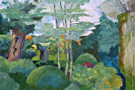
It started by pinpointing what I really care about, right now it is gardens, the ones designed by Piet Oudolf in particular. I’ve already done some felt works based on his urban prairie compositions, and I knew I didn’t want to get into depicting garden scenes realistically. (So fiddly with all the flowers- little dots and lines was not where I wanted to go.) So I just worked with super simplifying the shapes of clumps of plants, and concentrated on the wonderful interplay of colours and light. I also started a painting of just foliage- the dreaded foliage! There are good reasons why many painters shy away from trees and shrubs- all those leaves, and those pesky green shades! It is so challenging to not get lost in detail, and to differentiate the blue greens from the red and grey and yellow greens without everything getting muddy.

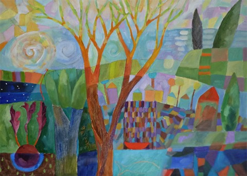
Dream garden Acrylic
In this painting you can see my attempt to translate a subject from felt to paint. I was aiming to keep it more decorative than realistic, it is still in progress. What I would do differently now is to separate the middle ground from the foreground, and also. either make it more graphic and abstract, or more realistic.
Here is one done at the same time, also not completely resolved (the right hand side needs more work), of what was essentially a green scene.
Kleine plantage acrylic
My breakthrough moment came after watching several YouTube tutorials. I may be a professional artist and painter, but after many starts and stops, I’ve only been painting continuously for about 6 years, and even if it was 36 years, I’d hopefully still be learning. So after I saw Colley Whisson’s tutorials in particular, I went to the easel and suddenly doors opened up.
There is a way painters see and think that is radically different from the way a draughtsman sees. The painterly way is to approach a scene through the values first, in big wide swathes of thinnish paint. Then the background and middle ground are coaxed out gradually by blending in different colours and strokes. Finally, the foreground is added in the same way. Big brushes, no finicky details and very little going back and fiddling with something. (Oil paints are best suited to this, but I work in acrylics for health reasons, so I miss a lot of that creamy blended look.)
This bold approach requires one thing, though – no, several things, I’ll list ’em:
1 Complete control of technique and materials. If you are still searching for how to paint certain elements, I doubt you’re going to be able to work spontaneously and freshly.
2 Knowledge and experience of how to paint anything and everything. In other words, you have to know how to paint it before you start.
3 Before a brush even hits the canvas, you’ve already made some important decisions: palette, overall colourway (ie is the painting going to be mostly earth colours? or blues, or greens, pastel or vivid?…). What is your focal point? How is the light behaving, and how does that affect your subject?
For me, learning to paint means unlearning a lot of habits from a lifetime of precision work- illustrating, graphic design, harpsichord decoration.
This one is going in a direction that feels right. What I love best about Colley’s work is how juicy and fresh it stays through every stage. A lot of that comes from working wet in wet, probably. My working method of layering colours tends to gradually tighten up without me really meaning to, and eventually losing that freshness. But progress is being made. Right now I use retarder with my acrylics which keeps them moist longer. This one below is almost done. Can you see the difference in approach?

Autumn garden in progress acrylic

And this one was added after I posted this, I felt the one above didn’t have enough light in it, so added the lemon yellow strokes and some other highlights. Now it is done.
Art & garden
August 19, 2017

museum and café buildings with entrance to garden top middle
Gardens and art, art gardens. I’m reading a book about the wild garden of the imagination (it’s in Dutch, not easy reading in any language, author is Kris Pint).
And in the book I’m writing about alternative paths for the arts, gardens and greening projects keep cropping up. Everything for me, after an active career in the arts and graphic design, seems to lead back to the garden.
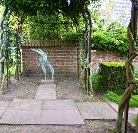
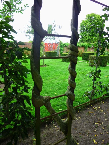
Yesterday my sister in law and I visited one of my favourite museums, Museum de Buitenplaats in Eelde. Roughly translated the name refers to ‘the outside’. The museum and gardens were designed as a whole, and when I first saw the building and gardens about 10 years ago, I was already enchanted. Now, the formal gardens have matured, the garden artist’s vision has been realised, though as with all living things, it is still in constant development.

garden entryway
We went to see a show of the English portrait artist, Michael Reynolds. The paintings inspired me in their application of paint, and colour. Then we visited the gift shop (yummy), and afterwards, finally, the gardens. We ended with a cuppa in the café and a luscious piece of cheesecake. Nourishing on all levels. But the gardens lifted my heart most of all. The formal structure, balanced by playful details and strategically placed sculptures, gives a sense of order and peace. In August most of it is carried by form- in a symphony of greens. Flowers are present for sure, but the riot of flower beds contrasting with the high walls of green hedges is probably at its best in June and July.
glass and metal sculpturee
I think what I love most is to be amazed- either by art, or by turning a corner in a garden like this and discovering a little water feature or sculpture. The sculpture in the middle of the pond is by Lotte Blocker, I was deeply touched by her exhibition in Zwolle several years ago. How wonderful that her work has been placed here as well. It is perfect.

pond with sculpture
Not shown is a new orchard just planted, with old apple races that used to grow here on this estate 300 years ago. The museum itself is part of a complex of beautiful buildings that are also full of art and sometimes open to the public for guided tours. Though the main museum building is ultramodern, a lot of attention is paid to the history linked with the location. It is a sense-around experience that makes me wish every museum had its own garden!
espaliered pear trees

wisteria pods
Black & white
July 29, 2017

There is a book of Juane Xue’s work called , ‘Color is my wealth’. I share this sentiment, as color is the driving factor in most of my paintings.
But lately I’d been craving the feel of charcoal in my hand, the smooth way it goes onto the paper, the play between dark, rich passages, and lighter ones lifted out with a kneaded eraser. When I was 10 years old, I started out learning to draw with charcoal in my art lessons with Abe Weiner. It remains a medium I’m familiar and comfortable with. The fact that color doesn’t figure in charcoal drawings lets me focus on form and texture. Very relaxing actually. In painting you have to juggle form, value, intensity, all the while keeping an eye on color balance as well.
Our neighbor who keeps his horses in the field behind our house is very ill. Over the past 20 years, we have had so much pleasure from Bernardo, a large Groninger work horse and jumper. I rode him once, and D let me help train him, and taught me to fit him up with all the carriage equipment and harnesses. Whenever D was away, I attended to Bernardo’s sore hoof, and made sure that he had enough food and water. Now his owner is in the hospital, the horse will probably be sold.
I made these drawings for him to remind him of the good things in life, while he lies in pain in a bed far from his home and horses. The second sketch is of Junarla, and her new foal, Juno, quite a character already as you can see below. D bought Juno in a more optimistic time, to have a new horse to train because Bernard is already around 20 years old. I sent the drawings off last week, hopefully they are giving our friend some solace. I guess Juno, now 2 1/2, will be sold as well.

Juno and Junarla, ‘Come on mommy and play’ charcoal on paper 18 x 24″
Letterwork revisited
April 8, 2017
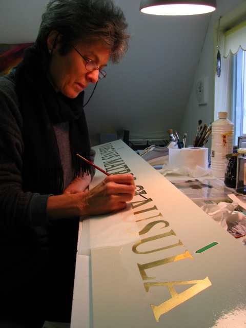
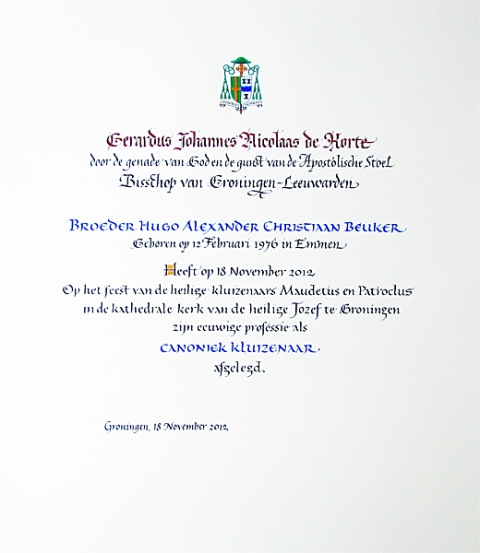
Yikes, calligraphy. Here’s me about 10 years ago, (looking a lot younger than I do now 🙂 ), doing some heebie jeebie work for a friend of ours’ church. I’m including it and a certificate done for the same person to show basically what my commissioned work was for 40 years or more. Precise, traditional, nerve racking a lot of the time. If you make a mistake you can start all over.
It took years to free myself up from the calligraphic, graphic design, and typographic training I had, to begin to find my own voice. Evert van Dijk, a dear friend of ours and fine calligrapher/artist was instrumental in helping me to get away from obsessive perfectionism and to find my own writing styles and rhythms. Also, the work I did with master typographer and calligrapher Jovica Veljovic helped me to allow small imperfections to appear in the work. He taught me that, if executed with knowledge and experience of spacing, letter weight, etc, the overall impression would be of competence and the little glitches wouldn’t be noticeable.
Well, I’ve recently had a chance to do some lettering again. And Jovica’s tip really came in handy. Rende and I made some signs for our local edible garden. I wanted them to be nice, but since there is a fair chance of them getting stolen or damaged, I didn’t want to spend hours and hours on them. So without lines, no sketches, no preparation except 3 layers of varnish, I just took a loaded brush and lettered them freehand. You will see that they are not perfect by any means, but (especially because they are read vertically) they make a convincing impression of good lettering.

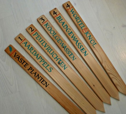
The signs are to label the beds for crop rotation, which happens over a period of 4 years. The idea is the first season, to plant the vegetables (like potatoes) which take the most nutrients out of the soil in one bed, and the next season to plant much less demanding plants in that bed, moving the potatoes to a new bed. The translation of the Dutch is:
Vaste planten= perennials
Aardappels= literally Earth apples or potatoes
Peulvruchten= legumes like peas, beans, snowpeas, sugar snaps
Koolgewassen= cabbage-like veg, broccolie, brussels sprouts etc
Bladgewassen= lettuces and other leafy greens including squashes
Wortel & knol= root veg, like carrots, onions, celeriac
And now for something entirely different. I was inspired by a friend’s book of poetry and photographs to pick up my pens and brushes again for some freehand calligraphic art. Here are some of the results. And here is Jörg’s website (German language).
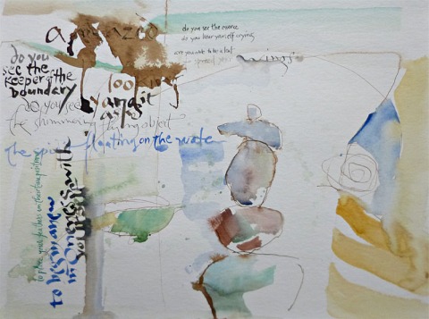
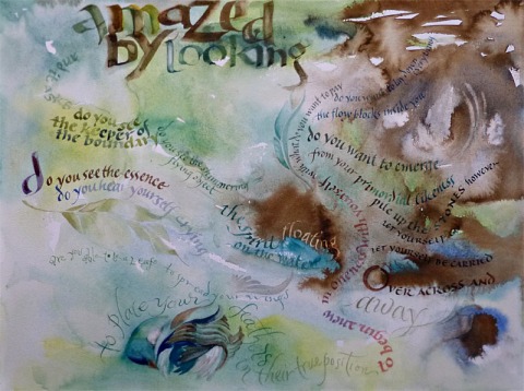
The style used here is inspired by my piece, ‘Wage Peace’ which you can see and read about here.
Real felt birds
March 11, 2017

photo Rende Zoutewelle
Painting has been low key for awhile. I’ve tried showing up at the canvas anyway, but end up just rehashing stale ideas. It is a period where I need fresh input, so I’ll be giving it a rest until inspiration comes again.
Meanwhile, I’ve been working on the little guy above. I’m not quite sure what got me started on making felt birds. I had made a flock of them as brooches several years ago.
Maybe it is because the birds around here (northern Europe) lift my spirits. Not only do I regularly see blue cranes on my walks, but also flocks of geese stringing across the big skies chattering and calling to each other; and that rare treat, a swan family, whooping above with the wonderful whooshing of the wings. You just feel like you got blessed when they have passed by.
My husband has rigged up several bird feeders close to our large dining room windows and we’ve come to know the regular visitors well. Sparrows of course, coal tits like the one above, chaffinches, blue tits, ring doves, and English robins are the main ones. I just love the coal tits with their neat little black fronts and soft yellow bellies and sides. They like sunflower seeds best and will perch at the feeder tossing out everything else until they get to a prize, then they retreat to a higher branch and crack it open by holding it between their claws and pecking at it until they get to the meaty part. Chaffinches and robins will sit on the ground gratefully picking up the rejects thrown out by the coal tits. Watching the interactions between the birds is also entertaining.

So basically I made these birds to keep me company upstairs in my studio. The chaffinch is kind of crude, it was a first prototype . They definitely have some kind of presence, though, because our dog is jealous of them!

photo Rende Zoutewelle
If I do make more (not for awhile, they are So Much Work) I’d do a sparrow next. They are incredibly beautiful when you stop to look – with soft grey feathers and reddish chestnut caps and streaks of black, and various browns on the head and wings. There are also white accents, bringing out the contrast of all the different feathers. And did you know there are dozens of different types of sparrows? I didn’t until recently.
Anyway, the weather here is more springlike, so instead of sitting inside making felt birds, I’ll be out in the garden enjoying the real ones!
Canals and edible gardens
January 14, 2017
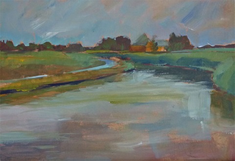
These two images were a departure of sorts for me, they are based on some photos I took in high summer last year. I don’t get inspired much by the idea of painting landscapes, it feels too limiting. But these two small format pieces on panel were done with a large brush to keep from getting caught up in details, and I like their freshness.
Every day I walk through these wide open Dutch skies and fields. There is a lot of water where we live, giving movement and direction to the flat, spread out landscape. I am constantly moved by the land here, how the light hits trees and fields, the changing colours throughout the day. It would be a natural painting subject if it weren’t milked ad infinitum by good and bad local painters. I have rarely found an ‘in’ to painting my surroundings because I like to use lots of colours and I need room for fantasy as well as reality.
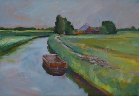
Here is another realistic one from the same series:
This piece, done more recently, is more in line with what comes naturally to me. I love how the landscape elements creep into the still lifes, or is it the other way around? It is also large, 50 x 50 cm.
This one below was more successful to my eye, I knew more about where I wanted to go with it.
Pears and bottles acrylic on canvas board
I love the small boat in the upper left corner, floating on a sewn sea with little red stitches. These pieces definitely have their own rhythm and structure if I step aside and follow where they want to go.
The latest in the series:
Honey garden acrylic on canvas board
There were lots of surprises here, it is quite large, 50 x 70 cm. The little boat has returned to a more prominent place. The beet is kind of archetypal and the spirals please me.(There are elements reminiscent of some of Bob Knox’s work. A fellow artist from Findhorn who taught me by example, just how fun art could be. If you google him you’ll probably come up with a lot of his beautiful New Yorker covers.)
Leading on from here, ‘Garden’ is my new theme, I think. I’m totally inspired by our community edible garden and the work of Fritz Haeg.
What we really need more of
December 7, 2016
I’m writing this one off the top of my head, no research, not a lot of links, etc., though I’ve written about the topic extensively in my book in progress.
A very young child appears on Idols or on YouTube and a talent is discovered. Take Jonathan, a three year old at the time the video of him was put online, ‘conducting’ a Beethoven symphony in the living room. It was hysterical, but also so fresh, so open and completely uninhibited. Picking his nose (gratefully most of that was cut out), and at the end, losing his balance and giggling uncontrollably on his back on the carpet as only a 3 year old can.
Couple of years later- Jonathan at 5 in a tux conducting a real orchestra, very serious.
First of all, a disclaimer here- in J’s case, I think there is a genuine desire to conduct, and the hunt for fame and money doesn’t seem to be the motivator. There is truly music singing in this kids veins. So please, if any of his relatives see this, don’t be offended. I’m sure he’s maintained a lot of his original purity.
I’m actually thinking less of him and more of the kids that appear on Idols, with their pushy parents, greedy for the recognition and money the kids talent can be used to gain.
What I’m trying to point out here is that important things get lost when what starts out as a gift gets turned into a commodity.
Having the ability to sing, conduct, dance, etc is a gift. It is connected to intimate internal values like life path and purpose. It needs time to develop and mature and become one’s own. Gifts are connected as well to the larger whole, our gifts are gifts to our community as well as for ourselves. In many non Western societies, the gift is how money and goods move around, and there are clear guidelines for how a gift is handled. Is it kept or passed on? Is it used up, is it used as a diplomatic gesture? There are myriad ways a gift travels and as many ways it influences what it comes in contact with. Gifts are powerful, they can awaken forces which contain the potential to incite or heal, to create or break connections, and more. They engage the imagination and call to unseen powers to participate in the giving and receiving.
In many folklore tales, hoarding a gift for one’s own enrichment is often the first step on a road to calamity. And we feel this- we know why when something for the the good of the community is appropriated for personal use, it is wrong.
Lewis Hyde says that every artist labours with a gift. He names 3 ways an artist and gift interact: first is the gift of talent the artist has; the second gift aspect is developing the talent and engaging in the creative process, the artist moves to a new place; and third, the result or product of this process is also a gift. Hyde acknowledges that each artist needs at some point to find out how to keep the qualities of the gift amidst the inevitable pressure of interacting with a purely commercial system.
When young Idols winners, or young, undeveloped art talents are pushed into the spotlight before the talent has matured, before the person himself is mature enough to understand the nature and application of their gift, then we all lose something precious. The artist and their work become links in the commodity chain, and the values change from giving, gifting, freedom of expression, taking risks, doing something for the love of it- to ‘What do I get for it?’ We all know what that looks like and there is really nothing new to learn from it. Same old same old buy and sell.
But next time you see a conductor lost in the spirit of the music, leading his orchestra to new heights, or an artist working on a project making urban wildlife habitats purely out of love for the animals, or anyone at all using their hands and skills for love and/or betterment of something, try to see what that does to you.
My experience every time is that it opens a place of generosity and inspiration in myself.
Isn’t that what we really need more of?
