Letterwork revisited
April 8, 2017
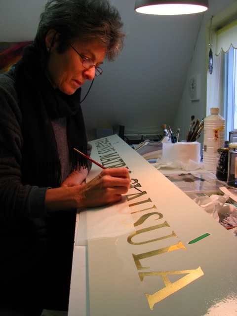
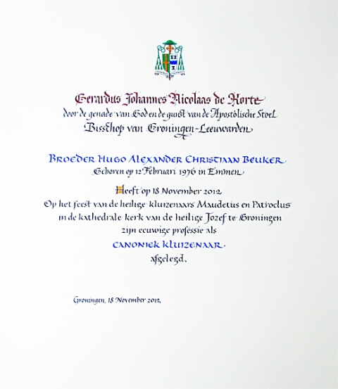
Yikes, calligraphy. Here’s me about 10 years ago, (looking a lot younger than I do now 🙂 ), doing some heebie jeebie work for a friend of ours’ church. I’m including it and a certificate done for the same person to show basically what my commissioned work was for 40 years or more. Precise, traditional, nerve racking a lot of the time. If you make a mistake you can start all over.
It took years to free myself up from the calligraphic, graphic design, and typographic training I had, to begin to find my own voice. Evert van Dijk, a dear friend of ours and fine calligrapher/artist was instrumental in helping me to get away from obsessive perfectionism and to find my own writing styles and rhythms. Also, the work I did with master typographer and calligrapher Jovica Veljovic helped me to allow small imperfections to appear in the work. He taught me that, if executed with knowledge and experience of spacing, letter weight, etc, the overall impression would be of competence and the little glitches wouldn’t be noticeable.
Well, I’ve recently had a chance to do some lettering again. And Jovica’s tip really came in handy. Rende and I made some signs for our local edible garden. I wanted them to be nice, but since there is a fair chance of them getting stolen or damaged, I didn’t want to spend hours and hours on them. So without lines, no sketches, no preparation except 3 layers of varnish, I just took a loaded brush and lettered them freehand. You will see that they are not perfect by any means, but (especially because they are read vertically) they make a convincing impression of good lettering.

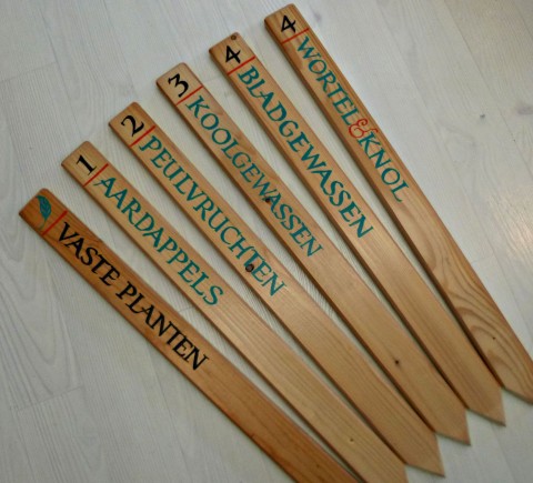
The signs are to label the beds for crop rotation, which happens over a period of 4 years. The idea is the first season, to plant the vegetables (like potatoes) which take the most nutrients out of the soil in one bed, and the next season to plant much less demanding plants in that bed, moving the potatoes to a new bed. The translation of the Dutch is:
Vaste planten= perennials
Aardappels= literally Earth apples or potatoes
Peulvruchten= legumes like peas, beans, snowpeas, sugar snaps
Koolgewassen= cabbage-like veg, broccolie, brussels sprouts etc
Bladgewassen= lettuces and other leafy greens including squashes
Wortel & knol= root veg, like carrots, onions, celeriac
And now for something entirely different. I was inspired by a friend’s book of poetry and photographs to pick up my pens and brushes again for some freehand calligraphic art. Here are some of the results. And here is Jörg’s website (German language).
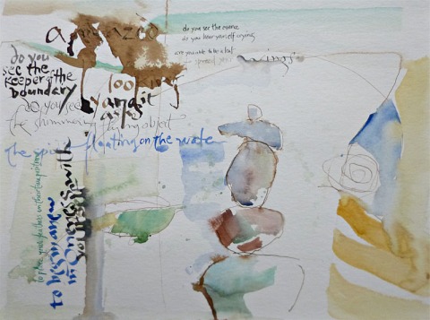
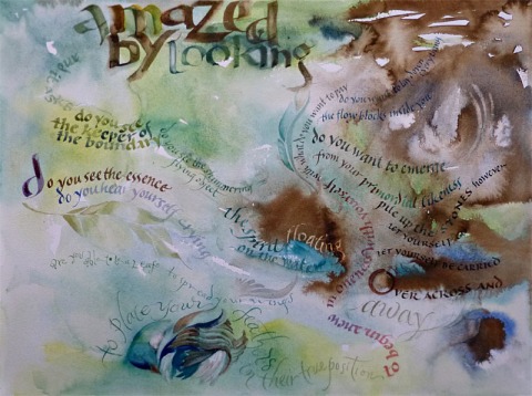
The style used here is inspired by my piece, ‘Wage Peace’ which you can see and read about here.
New inspiration: Robert MacFarlane, The Wild places
March 10, 2015

3 barns (watercolour sticks)
From the wood I turned south and began walking out along the sea wall. Swallows scudded overhead in twos and threes, moving with fast wing flicks…Inland were vast fields, on which three or four black barns sailed like barges. To the seaward of the wall were the marshes, tinged purple.
-Robert MacFarlane, ‘The Wild Places’.
It has been awhile since I was this moved by a non-fiction writer. Moved in the way the best art moves us: to quote Lewis Hyde, from ‘The Gift’: A work of art that enters us to feed the soul lets us experience a gifted state, and depending on our own abilities, we respond by creating new work (it doesn’t have to be art, but inspired by the artist we may find we can suddenly make sense of our own experience). The greatest art offers us fresh images that light up our imaginations and open up alternatives for our own lives.
The last time this happened I was in the middle of my career as an artist and calligrapher, and for years, I calligraphed one quote of Barry Lopez’s continually. Here is a straightforward handling of this particular quote-

Interior landscape (pen and ink and mono print)
But I also used the text as a starting point for work dominated more by imagery than by letters.

Arctic sunlight (collage, and mixed media on paper) sold
And I also did a series of collages, I think from the same book by Lopez, ‘Crossing open ground’.

Black throated sparrow (collage, pen and ink)
So anyway, what I’m getting at, is that for the first time in years, I feel inspired by MacFarlane’s writing and sensibility to start to combine letters with my imagery again.
Anyone who loves walking, nature, history of place, or good great writing should read this author. He sets out on these walks which take him and the reader to surprising places, both literally and internally. He’s exploring the theme of how landscape acts on us and we on it, and how outer landscape is formative for one’s inner psychic landscape. His experience resonates in a deep place with me, though I’m not drawn to emulating some of his other adventures – sleeping out on mountains and moors, by the sea and in dunes- sometimes in the winter!
I’ll leave you with some more of his words- here he is speaking about how being connected through technology has replaced and so robbed us of direct physical contact with the natural world:
We have come increasingly to forget that our minds are shaped by the bodily experience of being in the world- its spaces, textures, sounds, smells and habits- as well as by genetic traits we inherit and ideologies we absorb. A constant and formidably defining exchange occurs between the physical forms of the world around us, and the cast of our inner world of imagination.
The feel of a hot dry wind on the face, the smell of distant rain carried as a scent stream in the air, the touch of a bird’s sharp foot on one’s outstretched palm: such encounters shape our beings and our imaginations in ways which are beyond analysis, but also beyond doubt.
There is something uncomplicatedly true in the sensation of laying hands upon sun warmed rock, or watching a dense mutating flock of birds , or seeing snow fall irrefutably upon one’s upturned palm.
Transition and tending time
May 10, 2014

genuine (no tricks, promise) 4 leafed clover found on last walk
I just want to mention that I have 2 other WordPress sites.
Tendingtime is my transition blog- the story of my personal reflections and experiences as I navigate a period between life phases, professional identities, and lifepurpose. At first I chose to locate it away from artcalling because it really wasn’t about profiling as a working professional, but rather a more vulnerable venue for musings when moving away from a particular professional identity.
I also still meet prospective customers who want to see what I do, and was not quite ready to publicly reveal my profound sense of alienation from previous design, illustration and calligraphy commissions and deadline work on this blog.
Anyway, I paint regularly, teach and write, and am involved in some activism locally, so it isn’t as if I no longer work.
Now I am more certain of the kind of work that beckons me, I am less concerned about coming across as less credible to the aforementioned type of customer. I sense that my future work will take the form of collaborations with other artists and creatives in a similar phase to my own, and that once and for all any kind of professional posturing won’t be demanded of me.
So maybe I will in time, move tendingtime over here. It is an increasingly important part of my life and reflects honestly where I am on the subject of alternative paths for the arts. This last subject is why I started artcalling 7 years ago.
My other wordpress site, Artwell, contradicts nearly everything I just wrote, and is a showcase for my work. As well as being a gallery for my current oil paintings, I see it as a document of past achievements which I am proud to share. There is calligraphy, harpsichord decoration, oil pastel drawings, etc.
I wish Tendingtime had more of a readership. Having been spoiled on this blog with over 200 followers last time I checked, I’d forgotten how long it takes to build up a readership without being on Facebook or Twitter. What excites me though, is that that blog is connecting me to others with a similar philosophy and experience. Those are such rich connections and I am grateful for them. Rather one of those than 100 of the ‘I follow you will you follow me?’ kind.
So please go over to Tendingtime if you are interested. I am also using that blog to document walking ‘The Pieterpad’, my 480 km journey (in phases) from the northern to the southern tips of Holland.
The beauty of imperfection
October 8, 2013

Els’s apples 2
Oil on canvas board
This painting was started in the spirit of a 37 minute one, with the intention of working into it.
I enjoyed using the same fast approach, avoiding too much polishing. The discipline here is to find the balance between getting it ‘Right’ and letting it be. When you are limited by a 37 minute deadline with no opportunity to go back and correct, there is a better chance of a raw but honest painting. The catch when I do allow myself to work into it, is to let things that are ‘wrong’ stand anyway in service to the whole. But there are degrees of ‘wrong’, so as usual, it is an ongoing discovery process.
This one was painted over a strongly textured painting I’d done years ago, I liked working on that rough surface and how it influences the overall texture.
I learned something important from working with Jovica Veljovic, type designer and calligrapher. He advised, when working on a piece of calligraphic text, to not try to make too perfect letters when you start the piece. That way, if anything went wrong later, it wouldn’t jump out so much. If there were irregularities in the strokes, let them be there. In that way, all the little natural flaws would add up to a consistent looking whole.
Trying to make too beautifully perfect letters usually results in dead work. But allowing imperfections makes personal, alive pieces. Eventually, I have found, all the small quirks in one’s own writing form a unique visual vocabulary and over time, infuse the work with one’s own signature.

Title for magazine article Walnut ink and reed pens,
S. Zoutewelle
It is the same with painting.
‘Everything turns gold’- 4 new calligraphy pieces
September 24, 2013

Love was found, swimming by full moon

Heavy sky, empty land, threatening sea, the dike holds.

Low sun on the (Dutch) High land,
grain, cattle, folk,
everything turns gold.
A note on the above text- in the Gronings dialect, goud also means ‘good’. So in the Dutch, the sun is setting, touching all on the land with a golden light and all is good/gold

Put on the sky, today it looks good on you.
Friends of mine celebrated the 15th anniversary of their stone cutting business. Bertus is a skilled letter carver and we’ve had some great collaborations over the years. To celebrate, there was a poetry contest organised, the poems were not allowed to be longer than 45 letters. The poem winning the first prize would be carved in stone and presented to the village where Bertus lives and works. And the other top 9 chosen would be typeset or calligraphed. I received the commission to letter 4 pieces.
The text, loosely translated from the Dutch is under each piece. I used collage, watercolour, and oil pastel/gouache.
It was a bit difficult getting into doing calligraphic work again. But once into it, it was fun. They were well received and one, possibly two have sold.
The poets are, from top to bottom: Maarten Bronts, Frits Visser, Sijmen Tol, and Mischa van Huijstee
2 new oil fantasies, and an update
October 20, 2012

yellow coffee pot oil on board

orange in blue bowl, oil on board
Right now I’m working on another painting of the lilies, it is much juicier and is moving in the general direction I want to go. It is quite rough when you look up close, but holds very well as a realistic painting from further away. And there is more attention paid to the paint surface rather than just trying to get the objects right.
After a long period of working quietly on my own projects, my professional life is becoming active again. Here’s what’s up, and some of them will merit a separate post later on:
- My book, Chocolate Rain will be published in German!
- I’m also in negotiation with a Dutch publisher about the Dutch language rights, and if it works out with them, the book will be out in Dutch as well. If not with the present one, I really feel it is only a matter of time before some publisher here picks it up.
- John Killick’s wonderful new book is out, Playfulness and Dementia, a Practice Guide, Jessica Kingsley Publishers.
I’ll be reviewing it here before too long.I have a chapter in it. - I’ve been invited to take part in a symposium on art and dementia in Newcastle UK in November as one of 11 practising professionals in the field. This is sponsored by several organisations including National Association of Writers in Education, and ArtWorks, a 3 year project on participatory arts in Britain.
- When I’m in England for the conference, I’ll be speaking to Susanne Burns, the project director of ArtWorks, exploring ways I can work with participatory arts here in Holland.
- Once in a blue moon I accept a straight up calligraphy commission, this is a diploma for my friend Brother Hugo who will be taking his vows as an officially certified religious recluse in the Roman Catholic church.
- In the works- restoration of a 100 year old sundial in a heritage garden here locally. Another lettering job in collaboration with colleague, painter Ties de Vries.
Meanwhile I have a nice full group of oil pastel and drawing students here at home once a week.
One unfulfilled wish of mine is a course space here, but for now the dining room and part of the living room will have to do.
Wearable rainshower
July 11, 2011

Wearable rainshower
I’ve added a new brooch to my New Work and Shop page (see list at right).
Spoonful feature
May 4, 2011

Balloon by Jesophi, Jewellery Designer
I’m thrilled that the shop is featured on the blog of a delightful little zine I ordered, called Spoonful, a happiness companion. Thanks Anthea! It is, as the title suggests, a bite sized helping of food for the soul. There are hearty little snippets of literature, art, and musings on happiness, enhancing the everyday, creativity and more.
I ordered it to include in my shop as part of the mission of bringing in inspiration from all over the world into this tiny little village where I live. There are just so many wonderful things happening on a grass roots level in the area of creativity and community building that people here would never get exposed to without a guide. So I guess that is what part of the function of this shop is. Anyway, Spoonful is reasonably priced and beautifully presented, with a nice layout and colour artwork. I’m enjoying, after having read my 3 issues, dipping in and following some of the links, to say, Denise Sharp a creator of whimsical works in paper and calligraphy. Have FUN!
Marian Bantjes’ TED talk
July 3, 2010
I just watched a great TED talk while I was doing the ironing this evening. I am a great fan of Marian Bantjes because of my calligraphic background. She is one of the few real innovators when it comes to lettering. Her work is labor intensive, dense and decorative. And extremely ‘in’ in quality graphic design, art, printed media, and web circles.
What makes someone an innovator? If I look at her, and Keri Smith for example, you have two young women who have given an entirely new spin to an aspect of art. They are both articulate, so can communicate what they are doing and why they are motivated to do it. But just as importantly, they both have followed their hearts. They are both curious and passionate about a wide range of subjects and they work across disciplines. I think another important factor that makes their work highly recognizable and individual is that they combine hand work with the newest technology. Both are young enough to be perfectly comfortable in the digital world, yet they have craft sensibility.
Both women have a large following, they are breaking new ground for others to follow and in turn make their own discoveries. I especially liked what Marian said at the end of her talk about why she does the work she does and why ‘truly imaginative visual work is important to the society’.
I highly recommend watching this talk, it is also richly illustrated with her graphics.
How do you know when it is finally Right?
May 27, 2010
The cover design I was talking about in, ‘Does Creativity have to hurt?’ eventually broke through. I thought it might be interesting to explore here how artists/designers know when something is ‘Right’. And do you always know?
First of all a few words about how the breakthrough happened. I’d hit a wall with the designs I was working on, and very luckily there was a 3 day holiday here, so I put the cover aside for those days, regardless of the 31 May deadline. A bit difficult, since I work at home, and could go to the computer anytime,but I felt it was essential to detach from what I’d already done.
I thought about the cover a bit during those days, but I didn’t obsess about it, so the element of fear was absent. I deliberately concentrated on how well it was going to work out, and how many previous successes I’ve had with this process. I relaxedly surfed through a few cover design sites filling myself up with inspiration from others as well as learning what I did and didn’t want in my own cover. I have known the ‘feel’ I wanted for weeks, but have just not been able to get there by approaching it head on.
The night before I was to start work again, I took out my pens and played with making some calligraphic titles until I hit on one which felt right. And that was my starting point for the cover the next day. I also knew I wanted a casual, ‘in process’ looking sort of cover with a crafty feel, not a slick designy one. So I scanned in some brown wrapping paper as a background. With those two elements I built the cover out of collage and type exactly as I would an artwork in my studio. And I started getting excited about it, it started to feel like this was It.
And when I had it about 80% done, I knew it was the cover I wanted for my book. How did I know?
- It felt great to work on it, solid and constructive rather than searching and a bit frantic
- It made me smile
- It gave me energy
- It surprised me
- And when I was done, it filled me with happiness and satisfaction every time I looked at it.
There is something few non-artists know about the creative process, and that is how much of it is spent correcting mistakes and wrong directions. It is one big journey of wrong turns and trying to find your way back to the path.
Does this mean there is only one ‘path’ or right solution? No, but I think it would be safe to say, that there is one solution or type of solution for this moment in time, my particular level of development, the kind of book it is, and the requirements of the publisher and future customers.
Once I relaxed, and started working naturally, my own visual vocabulary kicked in and all the elements of play and the touch of quirkiness I wanted in the cover emerged. But they came in sideways as a result of attending to the practical aspects first.
So how do I really know this is the one, and not just one more version that isn’t It? Because there is nothing more that bothers me. It feels complete and in balance and so do I.
Another clue is that I no longer feel the need to ask anyone’s advice about it. Because I have satisfied my own standards first, nothing anyone can say would make a difference now.
It is not that I don’t find critique helpful, but having worked through this whole process, at this point it is important to honor my own vision and stick to it.

Cover
