3 books now available…
October 19, 2020

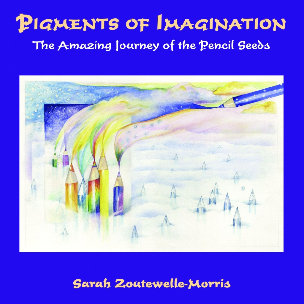

Click here for information about Sarah’s three books published by Kaminn Media in October 2020.
When your muse goes AWOL
May 17, 2018
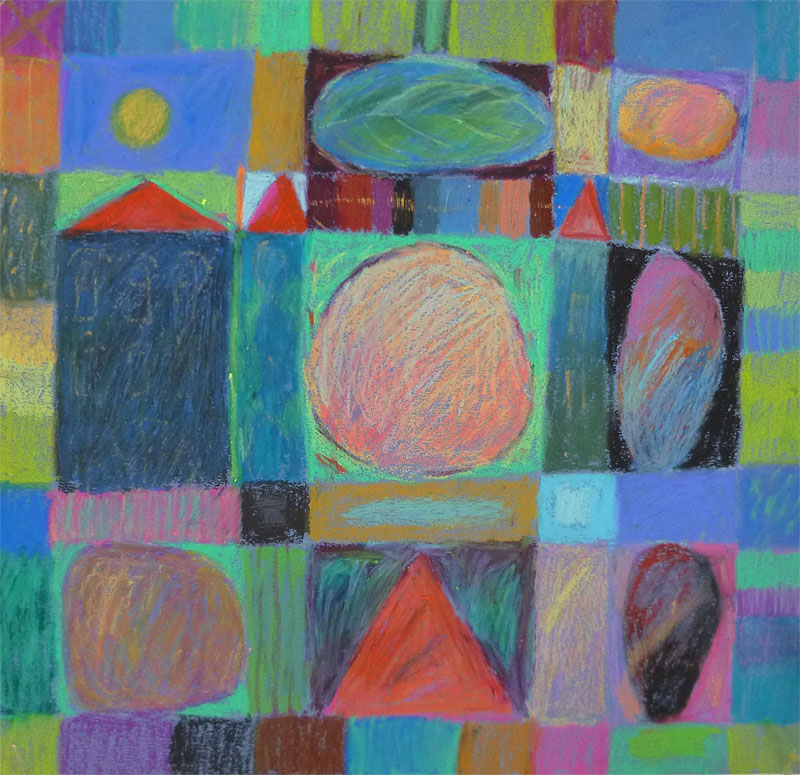
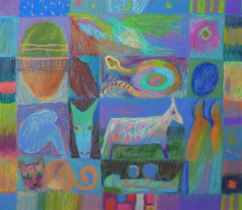
spring pacthwork oil pastels 30 x30cm
I finally moved the easel and paints, and all my brushes into the attic. They were taking up space in the studio and every day they reminded me that I was not painting. I’ve had ‘dry’ periods like this before, and always, the inspiration comes back.
Except that my situation is different now, I have a serious illness and most of my time and energy goes toward healing, whether is it going to and from treatments, or taking care of myself at home, it is nearly a full time job. (See my new blog appletreesz.wordpress.com if you want to know more.)
Admittedly, the fact that hardly any art sells these days (except for a fraction of artists who happen to be popular) is not very motivating for creating new work. And storage space starts to be a real problem. However when inspiration hits, these issues no longer weigh so heavily. You do the work for the joy of it, and worry about storing it later.
Anyway, when paints fail, I take out the oil pastels and play. Here are some recent pieces.These are kind of ‘new’ in that the figures and animals that have been wanting to appear in my work, have finally been allowed in. I’ve previously veered away from realistic subjects in my oil pastels, wanting to focus entirely on colour and pattern. But regular themes like houses and trees do recur.

Johan Scherft, his amazing paper birds
March 15, 2018
You might remember that I had a spell of making felt birds. They were so labour intensive that I only did two of them. Here is one.

my felt coal tit
I love birds, we live in northern Holland and our bird feeder sees a good variety of songbirds visiting every winter. I wanted a way to have birds around me in my living space too. When looking on the web for models to paint or construct, I stumbled upon Johan Scherft’s videos of paper birds and was immediately sold!
He offers quite a few free models on his site and I started with those. My first attempt was a firecrest, it failed miserably but taught me the basic principles- here is the second attempt. You can still see the seam where the head meets the body not quite perfectly, but gradually you get better at the glueing and fitting. This was a sweet but tiny model to begin with.

Firecrest paper bird model, all models designed and painted by J Scherft, and assembled by me
A word of caution, these are not projects to do with children, they are far too intricate, and they require a good dose of patience. The more I do, the better they work out, and the more appreciation I have for the exquisite rendering of the feathers, eyes, beaks etc. Not to mention how the whole birds are engineered, so that from a flat sheet of 80g paper, you end up with various parts- beak, head, tail cone, tail, which all fit together to form a perfect 3D model. Here is the firecrest sheet.


Cardinal under construction, this one is from the box available from Amazon

Here is the big guy done. Cardinals mean Pittsburgh and my US home to me, they have a special place in my heart, especially since they are not native to Europe, and we never get to hear their beautiful melodic trills here. God I miss them. But the blackbird’s song come in a close second.
Here is an American Goldfinch, also from the paper birds box. It costs around 16 euros and includes a great instruction book, glue, and 4 models plus mounts for 4 different birds, so you can make 16 birds from it. I just perched this little guy on a twig for now.


There is a lot to love about these bird models, one thing is how he captures the personality of each bird. This is a nuthatch and his mount is a little paper log, his feet are spread in a characteristic pose, one ahead and one pointing back, you usually see them hanging upside down on the bark of a tree.
You might be wondering by now if doing these birds is addictive. Well, I’m on my 8th model now, what do you think? :-). Thing is that the crafting is very meditative. With a small sharp scissors, you cut out all the parts, then patiently glue the tabs and let them dry one by one. It can take hours to make one bird and a mount, but it is so rewarding.
Here is the wren.


Today I finished the humming bird, it is in honour of my mother, Monica, who loved hummingbirds.
Here he is hanging in my studio. This, by the way is the Big model (!!) The life sized one is tinier and is a whole new challenge in itself. Scherft kindly offers this one free to practice on first. (The tiny life sized one is free too). And for many of the birds he has excellent tutorials available on his site and on YouTube.

Here is a view of my board in the studio, gradually I’m gathering all these little bird beings around me.
Inspired? Here is Johan’s site, have fun! And thanks Johan.

The thing about tutorials
January 17, 2018
Just musing here for a bit. I’ve been immersing myself in some oil painting tutorials, wondering if I want to switch back to oils again after 2 years of acrylic work (and several years of working in oils before that). In the last post I shared some of my recent work on a garden theme. I was feeling that I needed to develop a more painterly approach to complement my tendency to perfectionist draughtsmanship.
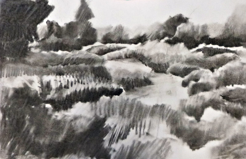
Charcoal value study of garden scene
Most of the tutorials out there I find too slick. There are tips offered, but often they are only tricks on, ‘how to paint trees, fruit, dogs, kittens, mountain views water’ and so forth. I avoid those.
I settled on Colley Whisson’s work because of the ease with which he handles the paint and complex subject matter. But as I got deeper into trying some of his approaches out in my own work, I found that I was moving away from my own truth and toward someone else’s way of working. This might be necessary up to a point when trying to learn new skills, but I notice now that I’m trying to paint like Colley, not like me.
I never wanted to make realistic landscapes or scenes. And actually, I think the woollen-felt pieces I did in response to Piet Oudolf’s gardens are closer to my soul than the paintings I’ve done of the same subject. The more I’ve followed the tutorials, the closer my work has been getting to conventional landscapes. The challenge for me is in the technique, but the intention of the painting is getting lost, since it is pulling me in a direction that I don’t want to move in.
Take a painter I’m moved by- Jeroen Krabbé. His joyful, decorative approach is totally unique to him (while many of the online oil painters are interchangeable to my eye). I’ve studied his work and seen his originals for the last 10 years and they always bring me somewhere new- in how I see, and in the possibilities of paint. The medium here is not so relevant, he works in oils, but his paintings would work equally well in acrylics. He’s a colour person like me.

Jeroen Krabbé, from his site
Oils are messy, they are stinking up my studio where I also spend a lot of time doing yoga, reading etc., and the clean up, despite not using terps or other traditional paint thinners, takes longer. I think I’ll finish up the one that is on the easel and put the oils back in storage for now and get back to the natural progressive process my work was moving in before I took this side trip. It was a fun trip, though.
Gardens and the dreaded ‘foliage’!
January 6, 2018
Emerging from an incubation period, never fun for me. Painting dried up, writing not working, all that is left is busy work and household tasks. Am I one happy camper during these phases? Well, what do you think? Still, as so often happens, getting back to work after an uninspired stretch something new emerged. What I’d been waiting for, actually.
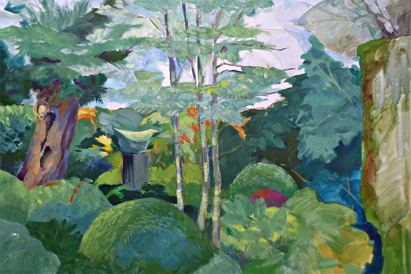
It started by pinpointing what I really care about, right now it is gardens, the ones designed by Piet Oudolf in particular. I’ve already done some felt works based on his urban prairie compositions, and I knew I didn’t want to get into depicting garden scenes realistically. (So fiddly with all the flowers- little dots and lines was not where I wanted to go.) So I just worked with super simplifying the shapes of clumps of plants, and concentrated on the wonderful interplay of colours and light. I also started a painting of just foliage- the dreaded foliage! There are good reasons why many painters shy away from trees and shrubs- all those leaves, and those pesky green shades! It is so challenging to not get lost in detail, and to differentiate the blue greens from the red and grey and yellow greens without everything getting muddy.

Dream garden Acrylic
In this painting you can see my attempt to translate a subject from felt to paint. I was aiming to keep it more decorative than realistic, it is still in progress. What I would do differently now is to separate the middle ground from the foreground, and also. either make it more graphic and abstract, or more realistic.
Here is one done at the same time, also not completely resolved (the right hand side needs more work), of what was essentially a green scene.
Kleine plantage acrylic
My breakthrough moment came after watching several YouTube tutorials. I may be a professional artist and painter, but after many starts and stops, I’ve only been painting continuously for about 6 years, and even if it was 36 years, I’d hopefully still be learning. So after I saw Colley Whisson’s tutorials in particular, I went to the easel and suddenly doors opened up.
There is a way painters see and think that is radically different from the way a draughtsman sees. The painterly way is to approach a scene through the values first, in big wide swathes of thinnish paint. Then the background and middle ground are coaxed out gradually by blending in different colours and strokes. Finally, the foreground is added in the same way. Big brushes, no finicky details and very little going back and fiddling with something. (Oil paints are best suited to this, but I work in acrylics for health reasons, so I miss a lot of that creamy blended look.)
This bold approach requires one thing, though – no, several things, I’ll list ’em:
1 Complete control of technique and materials. If you are still searching for how to paint certain elements, I doubt you’re going to be able to work spontaneously and freshly.
2 Knowledge and experience of how to paint anything and everything. In other words, you have to know how to paint it before you start.
3 Before a brush even hits the canvas, you’ve already made some important decisions: palette, overall colourway (ie is the painting going to be mostly earth colours? or blues, or greens, pastel or vivid?…). What is your focal point? How is the light behaving, and how does that affect your subject?
For me, learning to paint means unlearning a lot of habits from a lifetime of precision work- illustrating, graphic design, harpsichord decoration.
This one is going in a direction that feels right. What I love best about Colley’s work is how juicy and fresh it stays through every stage. A lot of that comes from working wet in wet, probably. My working method of layering colours tends to gradually tighten up without me really meaning to, and eventually losing that freshness. But progress is being made. Right now I use retarder with my acrylics which keeps them moist longer. This one below is almost done. Can you see the difference in approach?

Autumn garden in progress acrylic

And this one was added after I posted this, I felt the one above didn’t have enough light in it, so added the lemon yellow strokes and some other highlights. Now it is done.
Heartfelt
November 23, 2017
How does inspiration work for you? Or more precisely, how do you capture a moment of inspiration before it evaporates into memory. How do you let that moment become part of your life or work?
I get inspired mostly by other artists. The challenge is to translate that feeling of liberation and upliftment into one’s own circumstances. Sometimes direct copying can internalise the technique and make it yours. Or trying out another artists palette or brushwork can open up doors in your own work. I find that copying another artists subject matter generally leads to a dead end. I might make one piece inspired by someone else’s take on the world, but until I engage with my own interests and preferences, the work will lead nowhere. Your work needs to be fed by your own experience, that way it will keep growing.
A friend alerted me to a documentary on Dutch landscape designer and garden master, Piet Oudolf. I don’t know exactly why what he does hit me so hard (in a good way), maybe the time was ripe, maybe I needed just this kind of example for my book on new directions in the arts, but he nails it. Oudolf is a vital 71 year old garden artist. His work is making large prairie gardens in urban landscapes. The High Line gardens in NYC were designed by him, as were the Battery gardens, and in Chicago the Lurie gardens, (an ex rooftop parking lot). (tried to reproduce some images here from the web, but they won’t take).

from the Piet Oudolf site no photo credit found
I guess what grabs me are the expanses of colour, the swathes of moving, living colour- blond grasses interspersed with deep red purple echinacea and sage. Oudolf loves the garden in autumn perhaps more than in summer. And he has opened my eyes to the beauty in black seed pods, died out grasses and plants, crisp faded flowers, the whole range of charcoals, rusts, browns, and silver greys that take over when the summer’s riot of colour has run its course.
Recently, when my painting was at a low ebb and writing wasn’t moving either, I was itching to do something creative with my hands. I look every day at the stack of beautifully coloured wool felt I have in the studio and decided to start on something, anything!!


The little coils I’d already done, they show most of the colours I have.
So with the colours of Piet’s gardens still humming behind my eyes, I started to piece together 10 cm strips of felt. On my bulletin board you can see a pieced felt work I did a few years ago. I was inspired by the middle strip of warm pinks and yellows, set off by the soft neutral squares surrounding it.


So I kept making these felt panels with only a vague idea of wanting to somehow express my enjoyment of the Oudolf gardens without depicting them realistically. Below is the result.

hand sewn pieced wool felt, 5 seasons
I wasn’t finished yet and made a new panel, just keeping to the tints in the winter garden. Then I did one for late fall: with the low autumn sun hitting the golden grasses and with some of the most beautiful fall plants in bloom, these colours just sing. The technique also started to evolve, instead of just piecing like an inlay, (see bright orangey triangle between the white and black strips just under here), I started appliquéing the pieces right on top. You can see this clearest in the bottom third of both panels.


And finally, I worked on one just in tints of green and purple. This one is more descriptive, not sure how I feel about that, if I don’t watch out, I’ll be incorporating embroidery and beads and the whole thing will go kitchy. Maybe I’m just frustrated that I can’t get out into my garden now that winter is coming. Anyway, I wanted to show how inspiration from one man’s garden designs sort of came in sideways and started me off on this new felt work.

Bigger and bolder
November 8, 2017

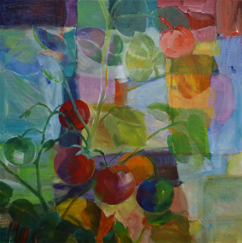
Tomato plant bold acrylic 50 x 60cm
The painting above was done in a rare mood of utter confidence. I knew where I wanted to go, sort of, and how to get there more or less. The background was a strong but rejected abstract which you can still see almost all of. I worked in big strokes, didn’t go back to fiddle (thank you dearest Robert Genn, r.i.p.) , and left the white lines (mostly) as accents against the dark background. This painting has gotten more appreciation from people who visit my atelier than any other work in a long time. Several are interested in buying.
Anyway, after the previous tomato plant series, and especially the one above, I found myself wanting more space to ‘spread out’, so I ordered several 80 x 100cm canvasses. Below you can see the proportions of the size I usually work in when I work big, 50 x 70cm. The grey area is the extra space I get when I want to work really BIG!.
So I put this (for me) gigantic blank canvas on the easel and………. Freaked Out!!! 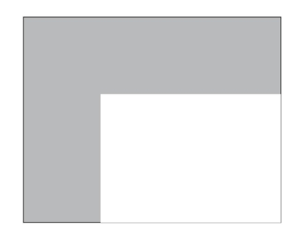
At first I tried an underpainting with a large brush and big swaths of colour, but it was way out of control. So I did the normal thing (for me) and divided it all up into manageable little squares and rectangles (oh great, I finally get a big canvas and what do I do, start working small again!), and filled them in until I got a feel for the whole space. Once I got into it, it was lovely to work large, moving my arms in arcs instead of just a dab here and there with fingers and wrists.
Here is the finished work.

Tomato plant, acrylic on canvas 80 x 100cm
There is a lot going on in the composition, but it all came together pretty well. It did take a long time, though and used a lot of paint. But it was a good experience and I want to do more like it. For now, the inspiration has wound down some, and I’ve moved on to other things for awhile until I gather enough courage and inspiration to confront another big guy!
The art of life
October 5, 2017

Tomato plant acrylic on canvas board 50 x 70cm
Every now and then, while painting, something amazing takes place. There is a sense of recognition. It is as if something, though wholly new, also reflects to me a part of myself I hadn’t yet met. I recognise it as ‘me’, and it is almost always a sign that my work is continuing to grow and develop in a direction that makes sense to me, but that I would never have been able to plan for.
It is about taking the next step in total trust, and keeping going when things don’t seem to be leading anywhere. In fact, the best breakthroughs seem to happen after one of those seemingly fruitless periods where every painting seems to be a repetition or failure, and you’re wondering whether to just put those brushes in storage and forget this whole thing!!

Morning light on tomato plant acrylic 40 x 50cm
This is the inner process of art, where while you are working on a painting you are also working on yourself. It is no coincidence that in my quest to loosen up in my painting, I am pointed to areas in my life which need letting go of. Not getting lost in detail in a painting, means ability to see the greater picture. Suggesting things in a composition rather than spelling them out ad infinitum corresponds to trusting more in life and going forward even when I feel I don’t have enough information. Trusting the process, getting out of the way, taking risks, staying true, being flexible- all about life and art and the art of life.
So these new pieces work on multiple levels. And I’ve been feeling slightly restricted by small formats, so tomorrow I’m getting some BIG canvasses. Stay tuned.
Most recent painting, tomato plant revisited acrylic 40 x 40cm
Little surprises
September 15, 2017
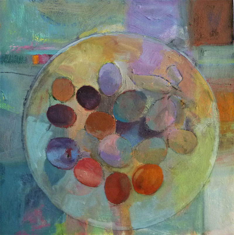
Pastel plums, acrylic on canvas board
Harvest. By the road, in our group garden, on the paths, it is clear that summer is over and what was sown can be brought in. I’ve always loved the colours of plums, bright jewels full of stored sunlight. I left quite a bit of the background painting in and didn’t over work this one.
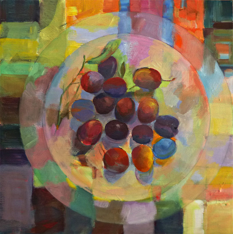
Bright plums acrylic on canvas board
The second painting was done over one of my abstracts, and the quality of those glowing colours was kept throughout. Once again, the aim here wasn’t quite ‘realistic’. I like how the abstract and the subject interact.
The next one below represents a breakthrough of sorts. I bought a new brush, a Liquitex Bright acrylic brush.Wonderfully springy and it holds paint like a sponge. I found a rhythm to my painting with this brush, it was like dancing. Once again I stopped before I got too tight with it, and I really like the grittiness of it. It is quite large, 50 x 60 cm.

Tomato plant 1 acrylic on canvas board
I thought I’d include one more in progress. I was curious to see how a second painting of the tomato plant would be if painted over a purposely brightly coloured background. It is still in progress, but I wanted to post this stage so you can see how it is set up. I intend to cover most of the bright colours, but still, they shine through in places giving depth and little surprises. I love little surprises.

Tomato plant 2 in progress acrylic on canvas
Art & garden
August 19, 2017

museum and café buildings with entrance to garden top middle
Gardens and art, art gardens. I’m reading a book about the wild garden of the imagination (it’s in Dutch, not easy reading in any language, author is Kris Pint).
And in the book I’m writing about alternative paths for the arts, gardens and greening projects keep cropping up. Everything for me, after an active career in the arts and graphic design, seems to lead back to the garden.
Yesterday my sister in law and I visited one of my favourite museums, Museum de Buitenplaats in Eelde. Roughly translated the name refers to ‘the outside’. The museum and gardens were designed as a whole, and when I first saw the building and gardens about 10 years ago, I was already enchanted. Now, the formal gardens have matured, the garden artist’s vision has been realised, though as with all living things, it is still in constant development.

garden entryway
We went to see a show of the English portrait artist, Michael Reynolds. The paintings inspired me in their application of paint, and colour. Then we visited the gift shop (yummy), and afterwards, finally, the gardens. We ended with a cuppa in the café and a luscious piece of cheesecake. Nourishing on all levels. But the gardens lifted my heart most of all. The formal structure, balanced by playful details and strategically placed sculptures, gives a sense of order and peace. In August most of it is carried by form- in a symphony of greens. Flowers are present for sure, but the riot of flower beds contrasting with the high walls of green hedges is probably at its best in June and July.
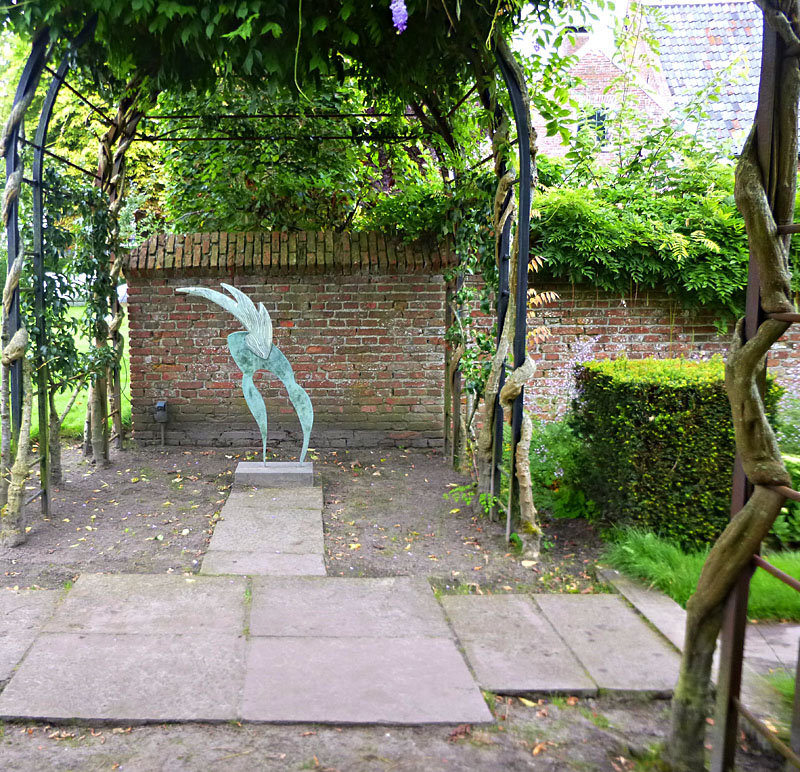
glass and metal sculpturee
I think what I love most is to be amazed- either by art, or by turning a corner in a garden like this and discovering a little water feature or sculpture. The sculpture in the middle of the pond is by Lotte Blocker, I was deeply touched by her exhibition in Zwolle several years ago. How wonderful that her work has been placed here as well. It is perfect.
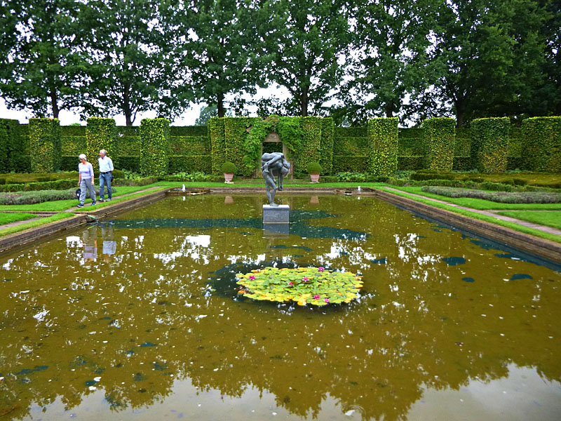
pond with sculpture
Not shown is a new orchard just planted, with old apple races that used to grow here on this estate 300 years ago. The museum itself is part of a complex of beautiful buildings that are also full of art and sometimes open to the public for guided tours. Though the main museum building is ultramodern, a lot of attention is paid to the history linked with the location. It is a sense-around experience that makes me wish every museum had its own garden!

espaliered pear trees
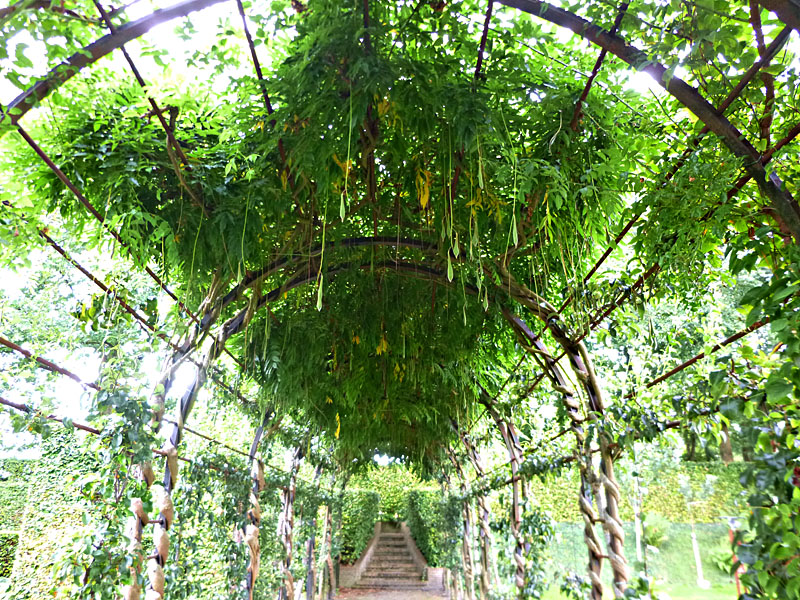
wisteria pods
